Colour
The nature and colour of porcelain
Porcelain is naturally a creamy white colour and so any colour added is softened; black, for example, is more charcoal and red tends to be pink. Porcelain has a slightly glassy surface and because my work is so textural, the light bounces in all directions and tends to pick up surrounding colours from the room. I have often been asked how many colours are in a natural porcelain Flow when there are none – just porcelain doing its thing. If in doubt about colour, you can do no wrong with using natural porcelain.


Origins of porcelain colouring
Colours are derived not from the pigments used in paints but developed from the clever mixing of elements, such as copper, cobalt and iron, which can survive the extreme firing temperature of porcelain (1,300 degrees centigrade). We purchase these stains from a range of ceramics suppliers and they alter from batch to batch. For all these reasons, the range of colours is somewhat limited compared to paint charts and the results are more instinct than science.
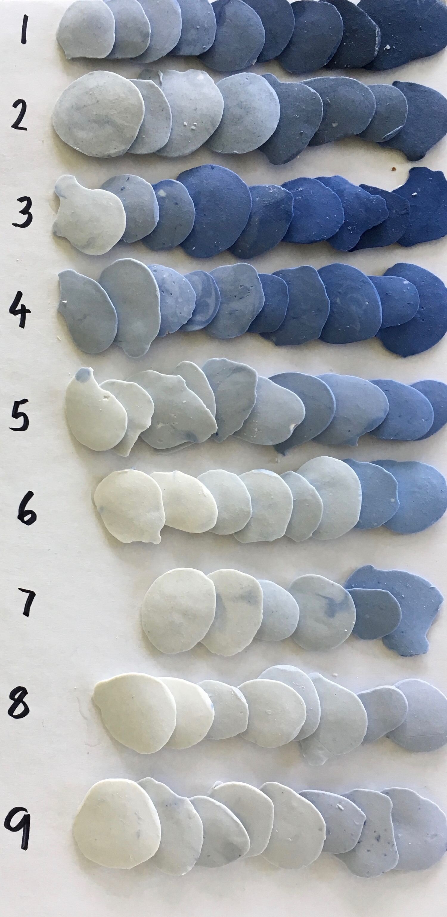
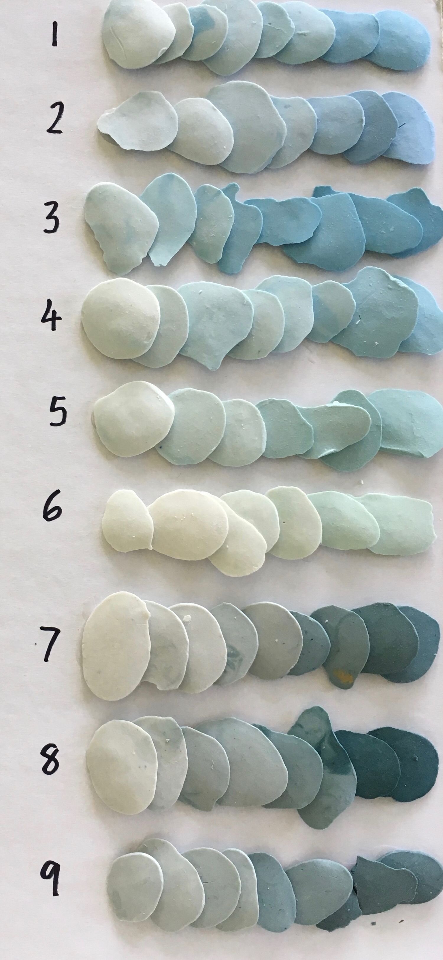
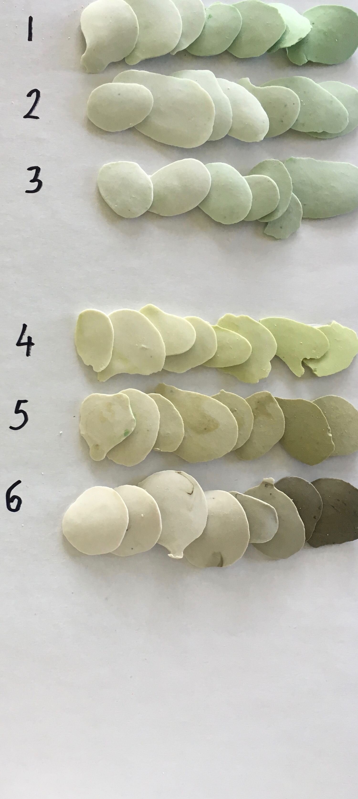
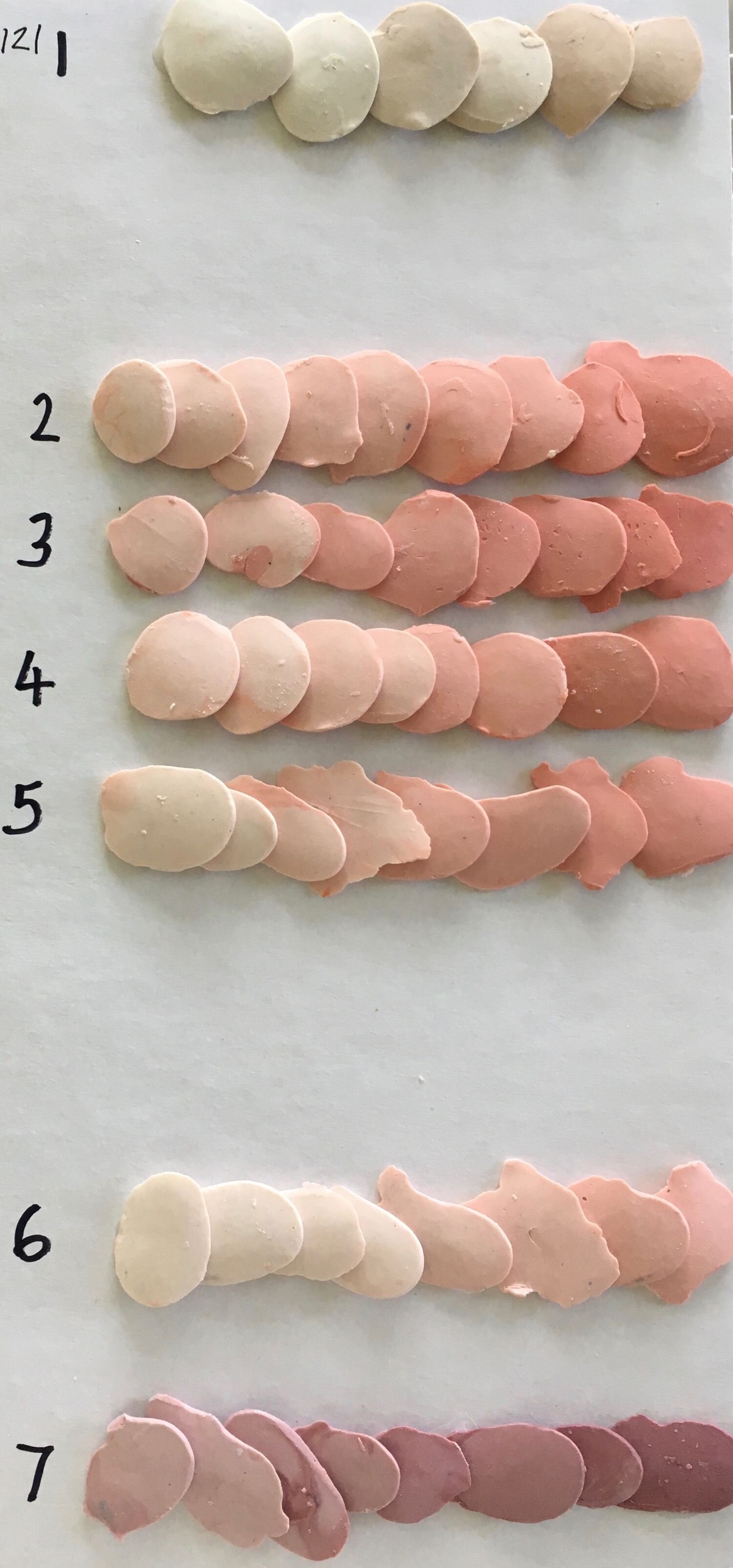
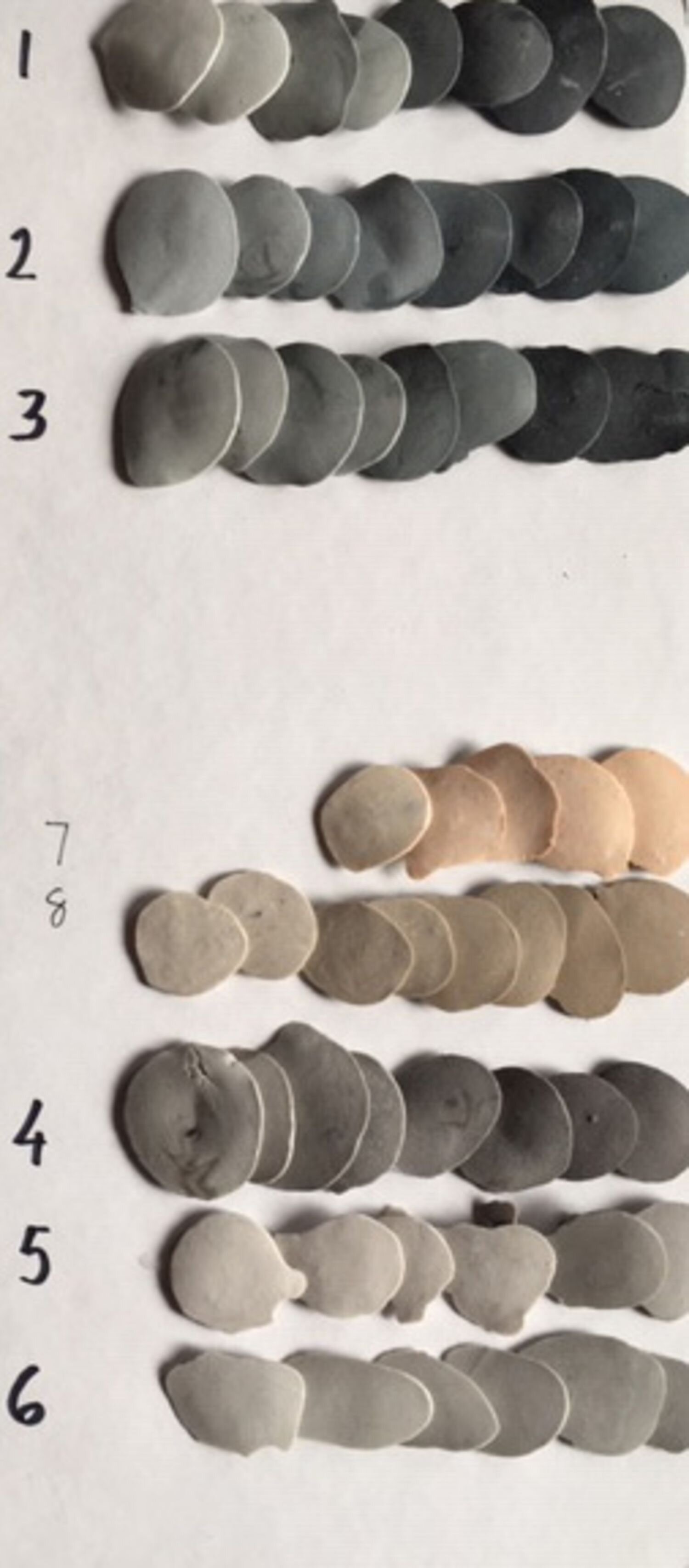
Colour range
We have mixed up our current range of colour stains to check how they are coming out. At first glance, it looks like there is a big choice but there are only about 10 colours in varying levels of saturation. The colour charts below give an indication of what we are working with.

Adding colour
Most potters give colour to their work through pouring glaze onto the surface or painting stains on. Colour is added to my work by mixing stains into the porcelain body – that is the porcelain clay is coloured right through. This way the porcelain surface is visible and the colour is more reliable.


Two tone colour
For two tone, the uppermost side of each “bead” of porcelain is a different colour to the rest of the bead. I developed this idea to emphasise the texture of a Flow; as you pass across the work the colour of the texture changes from one to the other and the whole Flow appears to shift. This is created by a thin layer of stained porcelain and often the colour behind is visible through, making an interesting surface close up. It is an extra cost and so only worth considering if the Flow will be in a position to pass by and may be visible from close-up, as well as afar.


Lighting
The biggest difference to colour comes from lighting; it’s direction, colour and strength, or lack of it. By directing lighting across the work from one direction, the texture wakes up and dances, and the colours vary with reflections and shadows. A light directly on the work, or no light, flattens the texture and reduces the colour palette. Even though the Flow in these images is multi-coloured, side light and flat light makes a difference to the textural interest.

Side light

Flat light